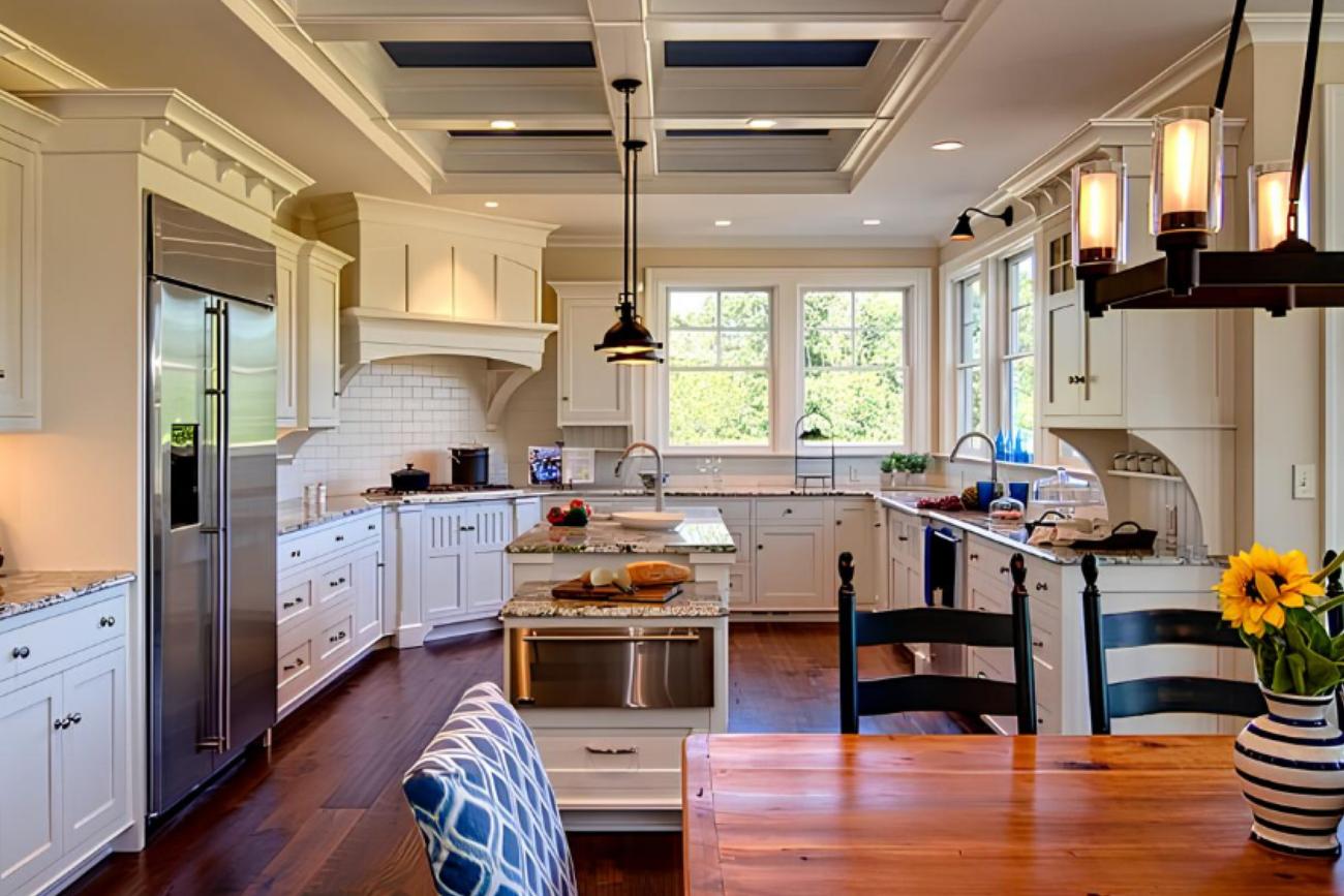

Cloud Dancer is more than just "a beautiful white". Pantone positions this color as a symbol of soothing influence and the value of stillness, as people are relearning to appreciate contemplation [1]. They also described Cloud Dancer as "like a blank canvas", evoking the need for new beginnings—dismantling old ways of thinking to open up new approaches[1][2].


In Time's analysis, Pantone emphasized that Cloud Dancer helps increase focus and free us from external "noise"; Leatrice Eiseman called it a discreet shade that carries "the promise of clarity" in times of transformation[2]. Architectural Digest also interprets Cloud Dancer as a non-sterile white tone, balancing hot-cold undertones, which feels "meditative" and "static" rather than empty; It is best seen as a means to find inspiration, rather than just as a background [3].
For material readers, here's the good thing: Cloud Dancer doesn't require us to "decorate more," but encourages us to let the material speak—the surface, the grain, the fibers, the light, the opacity/shadow... is where the story begins.


Pantone has always said that Color of the Year aims to "illuminate" the relationship between color and culture—that is, the color chosen often reflects a collective emotional need [2]. For Cloud Dancer, the message is quite consistent: as the world becomes frenetic/chaotic, humans need a visual symbol of serenity and tranquility.[2][3]

Pantone 11-4201 Cloud Dancer Palette (source: pantone )
There are three reasons why Cloud Dancer is the "right time" choice:
Social mood: tranquility is needed to rebalance.
Pantone describes Cloud Dancer as a "calming influence" that promotes relaxation and focus, creates space for creativity to "breathe", and paves the way for innovation [1]. TIME also noted that Pantone uses very clear language about "whisper of calm and peace", "blank canvas", "simplification" and "focus" [2].
Design language: minimalism is no longer style—it's need.
Architectural Digest commented that when the world is uncertain, many experts predict that 2026 is a time of neutrals and a sense of grounded; Cloud Dancer is the answer to "looking up at the sky": lighter, more airy, but still with depth thanks to the balance of undertones [3]. This fits well with the material landscape: users are increasingly sensitive to touch, light, and durability—something that a nuance-rich white can support.
Applicability: Cloud Dancer is the "frame color" for building mixing boards.
Leatrice Eiseman calls Cloud Dancer a "scaffolding color"—a frame color you can build on, going with every other color[3]. Architectural Digest also highlights its versatility in fashion, furniture, and tech; at the same time, it is suitable for consumers who are both concerned about sustainability and considering costs, need to choose colors that are "easy to live" and adapt for a long time [3].
If you're in the field of materials, Cloud Dancer is an "easy-to-work color" because it doesn't compete with materials—on the contrary, it amplifies the material.

Cloud Dancer is described by Architectural Digest as a "non-sterile" white tone, with a hot-cold balance, suitable for creating a sense of cleanliness while still being alive [3]. In design practice, you can use it for walls, ceilings, and large panels to optimize natural light and create "breathing space" for the rest of the concept.
Architectural Digest suggests that Cloud Dancer is suitable for plush fabrics and "soft" shapes, avoiding a stiff/rigid feeling; They associate it with the feeling of "weightless fullness" [3]. This is an opportunity for upholstery, curtains, carpets, bedding: ivory white highlights the textile fibers and creates a "warm" touch.

In particular, Pantone collaborated with Joybird to bring Cloud Dancer to "tactile" upholstery (evoking serenity and quiet reflection), and this color can be customized on many of its furniture models [3]. If you're blogging for a material reader group, here's a "very real" example of proving Cloud Dancer isn't just an idea—it's already made its way into the product.
One of my favorite passages in Architectural Digest: Cloud Dancer "embraces human craftsmanship"—when used on pottery, dishware, or crafts, this color supports the beauty of sophistication and even small imperfections[3]. With materials, that means: Cloud Dancer goes well with matte ceramics, bright stoneware, light grainy stones, grainy surfaces, and natural "noise".


Cloud Dancer can be used as a background to lift bold tones (navy, magenta, moss green, etc.) and can also accompany the earth board (brown, beige, green "forest-adjacent") while remaining balanced [3]. Pantone also described it as a "blank canvas" to create space for a new approach.[1][2]
Cloud Dancer was chosen for 2026 not because it's "safe", but because it reminds us of a very real need: to breathe slowly and see things more clearly[1][2]. To the interior and materials maker, this ivory white is like a subtle "backdrop"—letting the light, surface, and craftsmanship speak for themselves[3]. And who knows, just from that soft white layer like a cloud, you will open up a lighter space (and rhythm of life) for yourself.
[1] Pantone. (2025). Pantone Color of the Year 2026: PANTONE® 11-4201 Cloud Dancer. Pantone.https://www.pantone.com/uk/en/color-of-the-year/2026
[2] Burga, S. (2025, December 5). Pantone chooses white as its Color of the Year for the first time ever. See it here. TIME.https://time.com/7338176/pantone-color-of-the-year-2026/
[3] Nelson, T. (2025, December 4). The Pantone Color of the Year 2026 is... Cloud Dancer. Architectural Digest.https://www.architecturaldigest.com/story/the-pantone-color-of-the-year-2026-iscloud-dancer
[4] Chaudhary, I. (2025, December 8). Pantone picks "Cloud Dancer" as Color of the Year 2026. Parametric Architecture.
https://parametric-architecture.com/pantone-cloud-dancer-color-of-the-year/
The News 04/12/2025
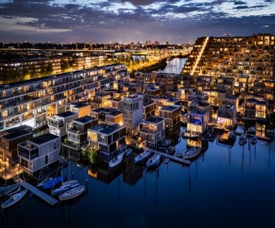
The Netherlands is one of the most vulnerable countries to climate change, with about a third of its area lying below sea level and the rest regularly at risk of flooding. As sea levels are forecast to continue to rise and extreme rains increase, the government is not only strengthening dikes and tidal culverts, but also testing new adaptation models. Floating housing in Amsterdam – typically the Waterbuurt and Schoonschip districts – is seen as "urban laboratories" for a new way of living: not only fighting floods, but actively living with water. In parallel with climate pressures, Amsterdam faces a shortage of housing and scarce land funds. The expansion of the city to the water helps solve two problems at the same time: increasing the supply of housing without encroaching on more land, and at the same time testing an urban model that is able to adapt to flooding and sea level rise.
The News 20/11/2025
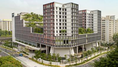
Kampung Admiralty - the project that won the "Building of the Year 2018" award at the World Architecture Festival - is a clear demonstration of smart tropical green architecture. With a three-storey "club sandwich" design, a natural ventilation system that saves 13% of cooling energy, and a 125% greening rate, this project opens up many valuable lessons for Vietnamese urban projects in the context of climate change.
The News 10/11/2025
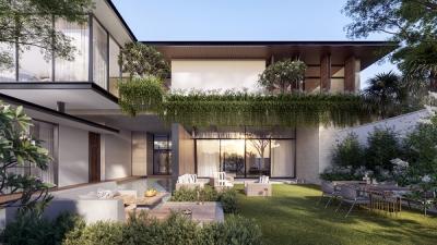
In the midst of the hustle and bustle of urban life, many Vietnamese families are looking for a different living space – where they can enjoy modernity without being far from nature. Tropical Modern villa architecture is the perfect answer to this need. Not only an aesthetic trend, this is also a smart design philosophy, harmoniously combining technology, local materials and Vietnam's typical tropical climate.
The News 25/10/2025
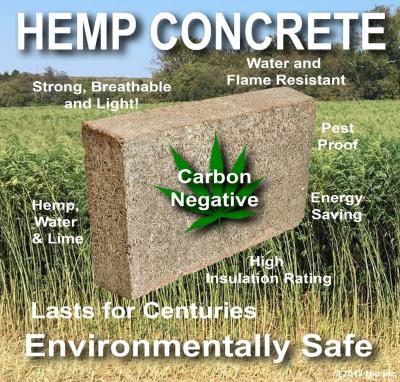
Hemp-lime (hempcrete) is a non-load-bearing covering material consisting of a hemp wood core (hemp shiv/hurd) combined with a lime-based adhesive, outstanding for its insulation – moisture conditioning – indoor environmental durability; in particular, IRC 2024 – Appendix BL has established a normative line applicable to low-rise housing, strengthening the technical-legal feasibility of this biomaterial.
The News 11/10/2025
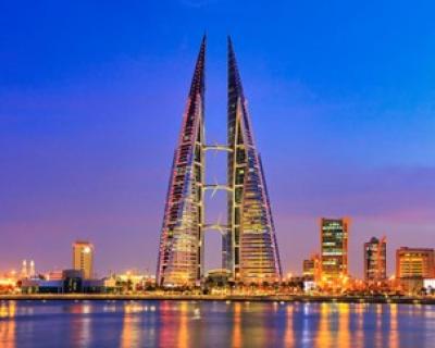
Amid rapid urbanization and global climate change, architecture is not only construction but also the art of harmonizing people, the environment, and technology. The Bahrain World Trade Center (BWTC)—the iconic twin towers in Manama, Bahrain—is a vivid testament to this fusion. Completed in 2008, BWTC is not only the tallest building in Bahrain (240 meters) but also the first building in the world to integrate wind turbines into its primary structure, supplying renewable energy to itself [1]. This article explores the BWTC’s structural system and design principles, examining how it overcomes the challenges of a desert environment to become a convincing sustainable model for future cities. Through an academic lens, we will see that BWTC is not merely a building but a declaration of architectural creativity.
The News 04/10/2025
As buildings move toward net zero architecture and glare free daylighting, traditional glass façades reveal limitations: high thermal conductivity (~0.9–1.0 W/m·K), susceptibility to glare, and shattering on impact. In this context, transparent wood (TW) is emerging as a multifunctional bio based material: it offers high light transmission yet strong diffusion (high haze) to prevent glare, lower thermal conductivity than glass, and tough, non shattering failure. Recent reviews in Energy & Buildings (2025) and Cellulose (2023) regard TW as a candidate for next generation windows and skylights in energy efficient buildings. [1]
 [3]. Đây là cơ hội cho các dòng vải bọc, rèm, thảm, bedding: màu trắng ngà làm nổi sợi dệt và tạo cảm giác chạm “ấm”.Pantone has announced the PANTONE 11-4201 Cloud Dancer as the Color of the Year 2026: a "buoyant" and balanced white, described as a whisper of peace in the midst of a noisy world. This is also the f)