 |
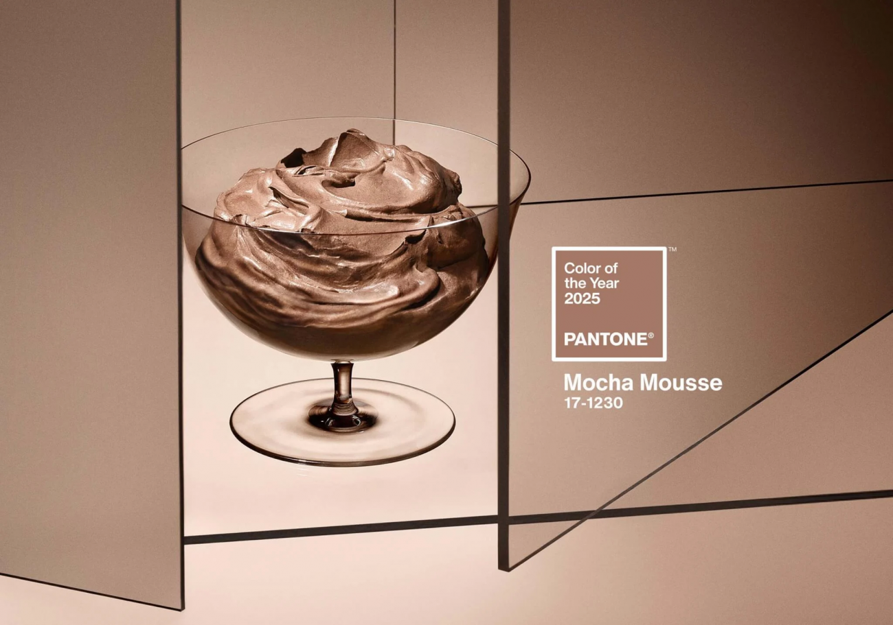
Mocha Mousse: A Symbol of Refined Indulgence Pantone has officially unveiled its latest color, PANTONE 17-1230 Mocha Mousse, a soft and mellow brown hue that embodies smoothness, subtlety, and sweetness. Leatrice Eiseman, Executive Director of the Pantone Color Institute, stated, “Grounded in our desire for everyday pleasures, Mocha Mousse offers a sense of thoughtful indulgence.” |
|
Mocha Mousse: More Than Just a Color
|
 |
A Sensory Experience with Mocha Mousse
Mocha Mousse engages not just the eyes but also the senses of smell and touch. At its New York launch event, attendees enjoyed chocolate mousse served on silver trays in an atmosphere enriched with the aroma of cocoa. This color evokes sensations of rich, melted chocolate and robust espresso while promoting the softness of smooth textures.

Versatile Applications in Interior Design
Mocha Mousse seamlessly integrates into interior design, offering warmth and comfort. Its refined and grounding hue complements a wide range of color palettes, from cool to warm tones, and from vibrant to soft shades. As a “design chameleon,” it shines as a standout accent color, makes a bold statement when used solo, or acts as a balancing tone alongside deeper pigments.
 |
 |
 |
A Glimpse into the Color of the Year 2025
“Mocha Mousse is a mellow brown hue that symbolizes warmth, sensory richness, and our growing desire for comfort and the indulgence of simple pleasures we can gift and share with others,” Laurie Pressman explained.
With its timeless elegance and versatile applications, Mocha Mousse is poised to become a favorite in 2025.
Source: Pantone USA

The News 25/12/2025
Walking by Ba Son at night and seeing the sky like "turning on the screen"? It is highly likely that you have just met Saigon Marina International Financial Centre (Saigon Marina IFC) – a 55-storey tower at No. 2 Ton Duc Thang (District 1). The façade LED system makes the building look like a giant "LED Matrix": standing far away, you feel like the whole tower is broadcasting content, constantly changing scenes according to the script.

The News 14/12/2025
Architectural Digest gợi ý Cloud Dancer phù hợp với plush fabrics và những hình khối “mềm”, tránh cảm giác cứng/rigid; họ liên hệ nó với cảm giác “weightless fullness” (nhẹ nhưng đầy) [3]. Đây là cơ hội cho các dòng vải bọc, rèm, thảm, bedding: màu trắng ngà làm nổi sợi dệt và tạo cảm giác chạm “ấm”.Pantone has announced the PANTONE 11-4201 Cloud Dancer as the Color of the Year 2026: a "buoyant" and balanced white, described as a whisper of peace in the midst of a noisy world. This is also the first time Pantone has chosen a white color since the "Color of the Year" program began in 1999. Pantone calls Cloud Dancer a "lofty/billowy" white tone that has a relaxing feel, giving the mind more space to create and innovate [1].

The News 04/12/2025
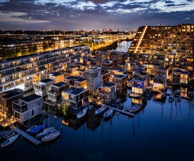
The Netherlands is one of the most vulnerable countries to climate change, with about a third of its area lying below sea level and the rest regularly at risk of flooding. As sea levels are forecast to continue to rise and extreme rains increase, the government is not only strengthening dikes and tidal culverts, but also testing new adaptation models. Floating housing in Amsterdam – typically the Waterbuurt and Schoonschip districts – is seen as "urban laboratories" for a new way of living: not only fighting floods, but actively living with water. In parallel with climate pressures, Amsterdam faces a shortage of housing and scarce land funds. The expansion of the city to the water helps solve two problems at the same time: increasing the supply of housing without encroaching on more land, and at the same time testing an urban model that is able to adapt to flooding and sea level rise.

The News 20/11/2025
Kampung Admiralty - the project that won the "Building of the Year 2018" award at the World Architecture Festival - is a clear demonstration of smart tropical green architecture. With a three-storey "club sandwich" design, a natural ventilation system that saves 13% of cooling energy, and a 125% greening rate, this project opens up many valuable lessons for Vietnamese urban projects in the context of climate change.

The News 10/11/2025
In the midst of the hustle and bustle of urban life, many Vietnamese families are looking for a different living space – where they can enjoy modernity without being far from nature. Tropical Modern villa architecture is the perfect answer to this need. Not only an aesthetic trend, this is also a smart design philosophy, harmoniously combining technology, local materials and Vietnam's typical tropical climate.

The News 25/10/2025
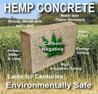
Hemp-lime (hempcrete) is a non-load-bearing covering material consisting of a hemp wood core (hemp shiv/hurd) combined with a lime-based adhesive, outstanding for its insulation – moisture conditioning – indoor environmental durability; in particular, IRC 2024 – Appendix BL has established a normative line applicable to low-rise housing, strengthening the technical-legal feasibility of this biomaterial.